Colorful Houses: Recreating an Old Work in Procreate
Colorful Houses: Recreating an Old Work in Procreate I by Larissa Yeung Fung
As creatives, we are always harsh on ourselves. We always look at our past work and think they are just so bad. I want to say it’s not always the case. Our past work deserves to be acknowledged. And if anything, we can always recreate an old work and make it better. It’s a good exercise to help us identify what had gone wrong with the old work, and push us to find a way to make it better.
Following this spirit, I decided to recreate the painting I did last time in Procreate and make it better.

Colorful Houses: Recreating an Old Work in Procreate Tutorial | the Challenge
Critiquing an Old Work
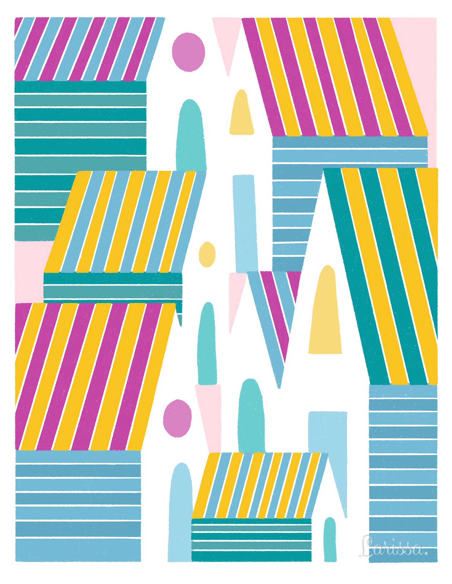
In the painting I did last time, I painted a number of houses using geometric shapes. I don’t think the color palette was well chosen. I don’t think the use of negative space was well executed, either. (See, I am being harsh on my work.)

Colorful Houses: Recreating an Old Work in Procreate Tutorial | Critiquing an Old Work
But I believe I can recreate it in a better way. So I have spent some time drawing the following sketch, and then transferring it to Procreate.

Colorful Houses: Recreating an Old Work in Procreate Tutorial | Hand-drawn Sketch

Colorful Houses: Recreating an Old Work in Procreate Tutorial | Sketch in Procreate
Deciding the Style of the Houses
Each of the houses has three parts: the front, the roof, and the side. I wanted the roof and the side to be painted in stripes. I also wanted to use negative space to represent the front of the house, except the door and the window are in simple shapes. These elements form the overall style of the houses in this work.

Colorful Houses: Recreating an Old Work in Procreate Tutorial | Deciding House Style
Drawing Houses
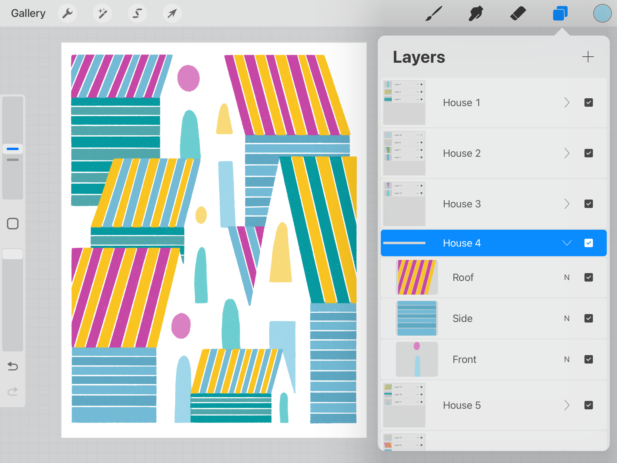
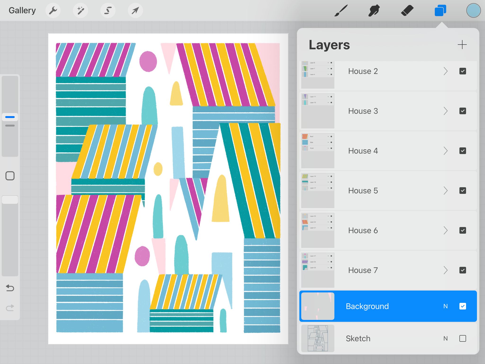
I want to briefly talk about layer organization in drawing the houses. In the tutorial, I started with the tiny house in the foreground, which is named House 1 in my layers panel. And of course, that house is on top of all the other layers. All other houses are placed accordingly from the foreground to the background of the work.
You can see in my layers panel that each house is in a group, which contains three different layers: Roof, Side, and Front. Since I have planned the style of the houses beforehand, it helps inform the way I organize layers.
I put the Roof layer above the Side layer, because the roof covers the body of the house. It just makes sense. The Front layer, however, is flexible. It can be above the Roof layer or below the Side layer. Since the Front part of the house is mostly negative space, that is without a defining outline, it doesn’t matter if the roof covers the front or not. (I hope that makes sense.)
Colorful Houses: Recreating an Old Work in Procreate Tutorial | Drawing Houses
Adjusting Colors
You can see in the tutorial that I adjusted the colors of the roofs halfway through the process. Originally, I used three alternating colors to paint the roofs. But the houses turned out to look quite similar in this way. Then I decided to change it to two alternating colors, so we can better tell the houses apart.
All I am saying is, assess your work along the way. If you feel the colors, the shapes, or anything that are not right, adjust them right away, don’t wait till the end.
Drawing Background
Now what is left is the background, which is formed by random shapes around the houses. I originally colored these shapes with a goldish color, but later changed it to a light salmon color. I think the light salmon color would work better with the vivid and playful feel of the work. And I am glad I made that change.
Colorful Houses: Recreating an Old Work in Procreate Tutorial | Drawing Background
You can download the color palette I used in this work:
Enjoy the tutorial and see if you could find an old work and recreate it to make it better.
Happy creating!